


Global per capita CO₂ emissions have (still) peaked
Global per capita CO₂ emissions probably peaked a decade ago.

I’m still waiting for the day that the world passes peak CO₂ emissions.
To address climate change we need emissions to fall quickly over the next half-century. But, before we even think about reducing global emissions, we need them to stop growing. We need to peak.
We do have one glimmer of hope that this might not be too far off. Global per capita CO₂ emissions have already peaked. In fact, they probably peaked around a decade ago.
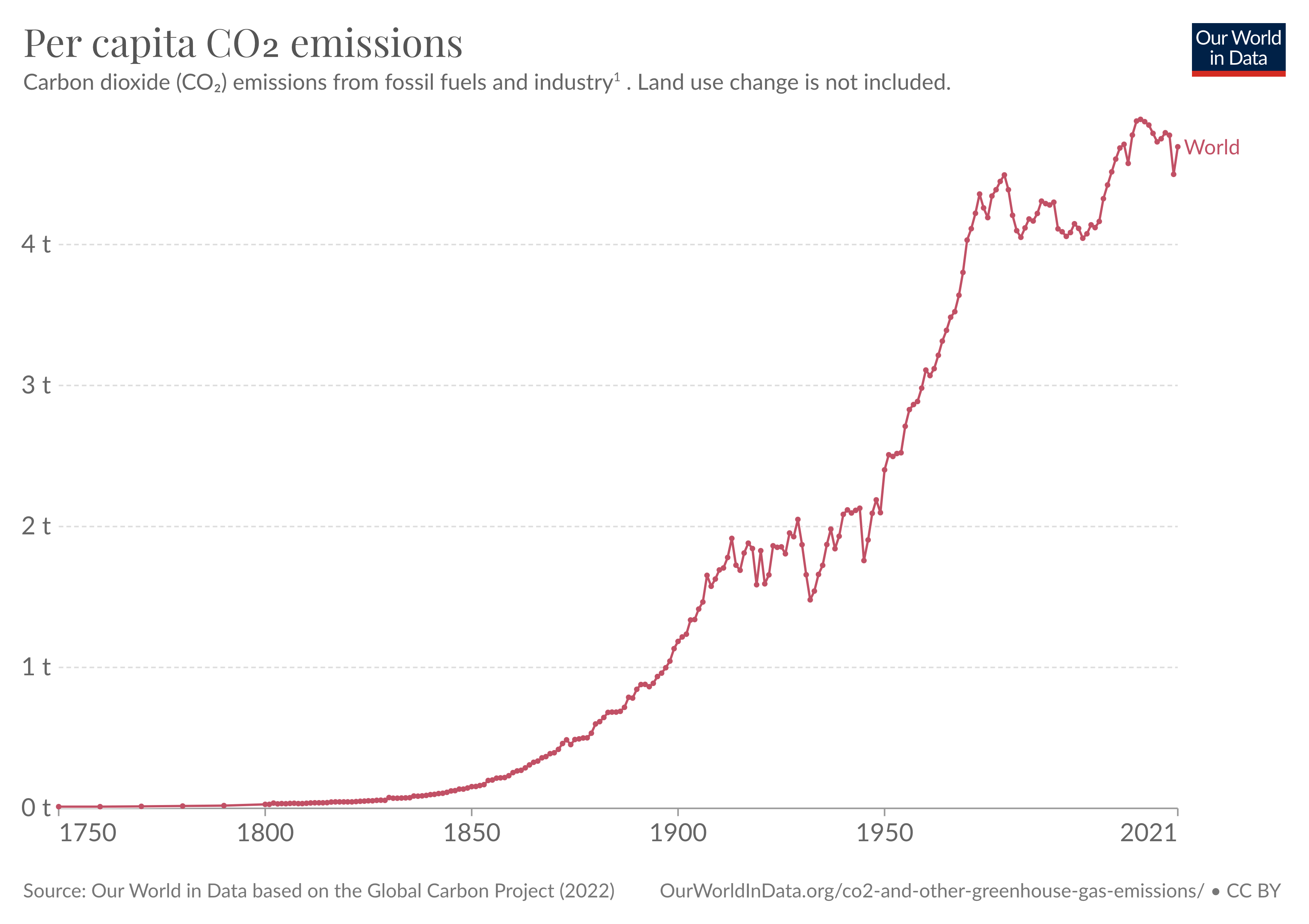
On Our World in Data we show data on per capita CO₂ emissions, based on data from the Global Carbon Project.1 Global per capita emissions appeared to peak at 4.9 tonnes per person in 2012.
The trend has hovered a little since then – before falling a lot during the pandemic before rebounding in 2021.
➛ You can explore the interactive chart (and much more CO₂ data) here.
A few weeks ago the Global Carbon Project released its preliminary estimate of emissions for 2022.2
I wanted to check if we’d called a peak too soon. It seems we’re still on track. By my calculations, per capita emissions this year were around 4.7 tonnes. A little higher than last year, but still below the 4.9 tonnes peak in 2012.

A peak in per capita emissions means a peak in total emissions is coming
Of course, the atmosphere doesn’t care about a peak in per capita emissions. It’s the total amount of CO₂ we’re pumping into the atmosphere that drives climate change.
We still haven’t reached a peak in total emissions.
Why, then, does a peak in per capita emissions matter? It’s a strong signal that a peak in total emissions is coming.
Total emissions will peak when per capita emissions fall at a faster rate than the global population is growing. Since global population growth is falling quickly, we’re in a good spot to do this.
It’s also a sign that we’re getting somewhere in decarbonising individual lifestyles. Extreme poverty rates have fallen, and global living standards have increased over the past decade (of course, with massive global inequalities and a dip from the COVID-19 pandemic). The fact that per capita emissions have been falling is a sign that we’re getting better at living better lives with fewer emissions.
As I will always repeat: this is not happening fast enough. To peak total emissions, and bring emissions down, we need to be moving much faster.
To calculate per capita emissions we combine this emissions data with population estimates from the UN Population Division.
Friedlingstein, P., O'Sullivan, M., Jones, M. W., Andrew, R. M., Gregor, L., Hauck, J., Le Quéré, C., Luijkx, I. T., Olsen, A., Peters, G. P., Peters, W., Pongratz, J., Schwingshackl, C., Sitch, S., Canadell, J. G., Ciais, P., Jackson, R. B., Alin, S. R., Alkama, R., Arneth, A., Arora, V. K., Bates, N. R., Becker, M., Bellouin, N., Bittig, H. C., Bopp, L., Chevallier, F., Chini, L. P., Cronin, M., Evans, W., Falk, S., Feely, R. A., Gasser, T., Gehlen, M., Gkritzalis, T., Gloege, L., Grassi, G., Gruber, N., Gürses, Ö., Harris, I., Hefner, M., Houghton, R. A., Hurtt, G. C., Iida, Y., Ilyina, T., Jain, A. K., Jersild, A., Kadono, K., Kato, E., Kennedy, D., Klein Goldewijk, K., Knauer, J., Korsbakken, J. I., Landschützer, P., Lefèvre, N., Lindsay, K., Liu, J., Liu, Z., Marland, G., Mayot, N., McGrath, M. J., Metzl, N., Monacci, N. M., Munro, D. R., Nakaoka, S.-I., Niwa, Y., O'Brien, K., Ono, T., Palmer, P. I., Pan, N., Pierrot, D., Pocock, K., Poulter, B., Resplandy, L., Robertson, E., Rödenbeck, C., Rodriguez, C., Rosan, T. M., Schwinger, J., Séférian, R., Shutler, J. D., Skjelvan, I., Steinhoff, T., Sun, Q., Sutton, A. J., Sweeney, C., Takao, S., Tanhua, T., Tans, P. P., Tian, X., Tian, H., Tilbrook, B., Tsujino, H., Tubiello, F., van der Werf, G. R., Walker, A. P., Wanninkhof, R., Whitehead, C., Willstrand Wranne, A., Wright, R., Yuan, W., Yue, C., Yue, X., Zaehle, S., Zeng, J., and Zheng, B.: Global Carbon Budget 2022, Earth Syst. Sci. Data, 14, 4811-4900, https://doi.org/10.5194/essd-14-4811-2022, 2022.
An important note on this data is that it is based on emissions from fossil fuels and industry only. Land use change is not included.
Land use emissions data is much more uncertain than emissions from fossil fuels and industry, which is why we focus on them here.
But, if we combine fossil fuels and land use emissions (see the chart here), it seems this peak still holds true. Per capita emissions were at their highest in 2011.
Thanks for this! I was having a conversation about global warming with a family member two days ago and I wish I had these graphs at the ready!
Does data point to this peaking being equitable? For example, how much is due to increasing availability of clean energy for people in energy poverty, compared to increasing proportion of clean energy for people that already are energy sufficient or energy-rich? Another way of putting it is that it would be concerning if the peak were due to an increasing trend in energy poverty (see this post for context for my comment: https://ourworldindata.org/worlds-energy-problem)