Coal has now died in its birthplace: the UK closes its last coal power station
It was a relatively quick energy transition by historical standards.
This is a short post with charts and data you may find interesting on the history of coal power in the UK (and where it stands globally).When I was born (and I’m not that old), more than half of the UK’s electricity was coming from coal.
When my grandparents were born, CO2 emissions from coal in the UK were around 10 tonnes per person. Close to double the per capita footprint in China today.
But in the last few decades, coal use in Britain has tanked, and its journey towards a coal-free grid ends today as it closes its final power plant: Ratcliffe-on-Soar.
The decline in coal power has been pretty rapid. Here it is as a share of electricity. Or you can find total production data here.
You can see this decline — extended to 2024 — in higher resolution from the great organisation Ember, whose report is well worth your time.

Death of UK coal in five charts
Five years ago, I wrote a piece looking at a range of long-term trends that mapped out the death of coal in the UK: The death of UK coal in five charts.
I won’t post them all here, but you might find them interesting.
Just to flag one: here’s the decline in employment in the coal industry in the UK. In the early 20th century, there were around 1.2 million people working in it. For context, at its peak, this was one-twentieth of the country’s workforce.
In the last five years that’s dropped to just hundreds of workers.
While this phase-out of coal power is a huge win in terms of environmental cost: not just in terms of climate change, but also air pollution and the safety of work (coal mines are really not a healthy place to work), it has had very obvious negative impacts on some local communities which relied on it for income and employment.
The UK’s coal decline is part of a broader trend across Europe and North America
Coal power is on its way out in many countries, especially in Europe. Below you can see the drop in the share of electricity coming from coal across a range of countries (you can explore this data for any country here).
Coal production is not yet falling globally. It has been expanding rapidly in Asia over the last few decades, as you can see in the chart below.
It’s worth looking at this in per capita terms for context, though. Per person, Asia has only just passed North America (most of which is the United States). It’s also just reaching the per person levels of coal in Europe in the 1990s.
I know people will make the “the atmosphere doesn’t care about per capita” argument, but it is an important perspective when it comes to “fairness” in opportunities for economic development and poverty reduction.
There is some hope/speculation that global coal use is on the brink of a peak, mostly due to a peak in China (I wrote about China’s coal outlook near the start of the year). It would be the first fossil fuel to peak and decline.
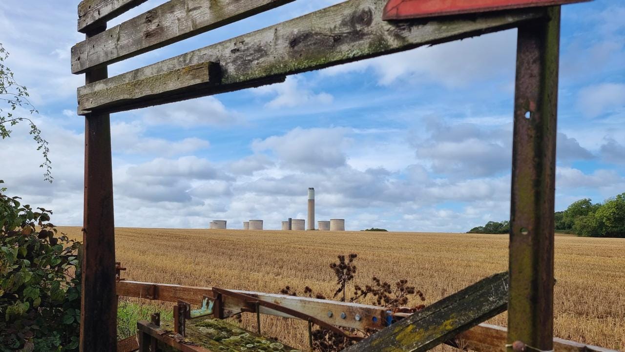
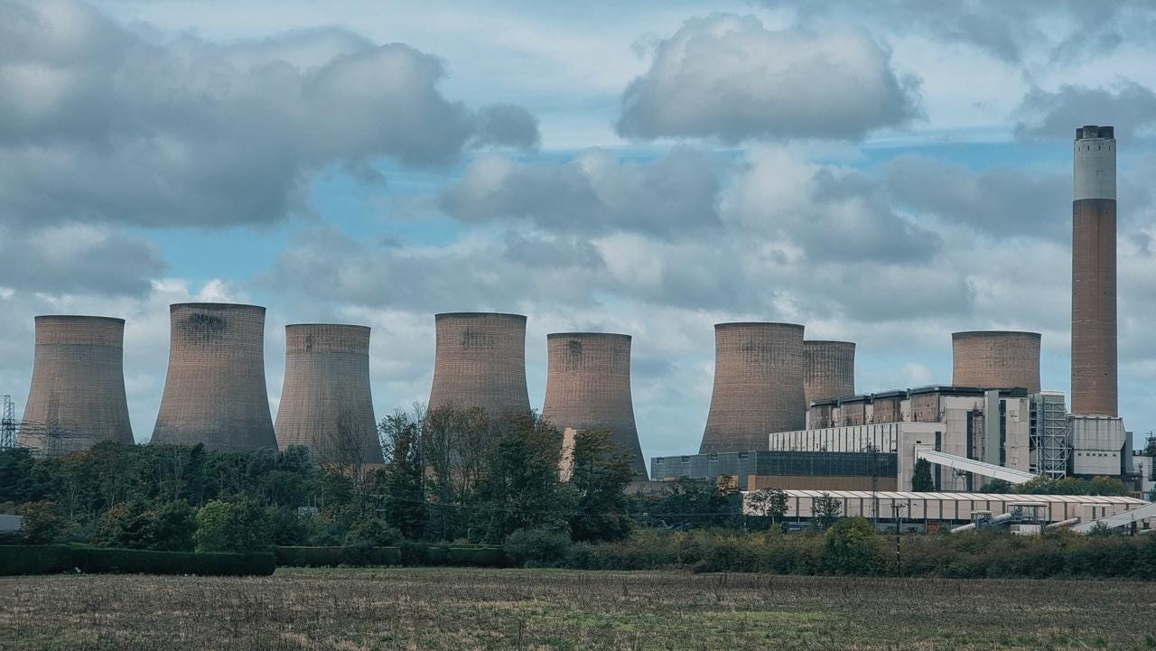
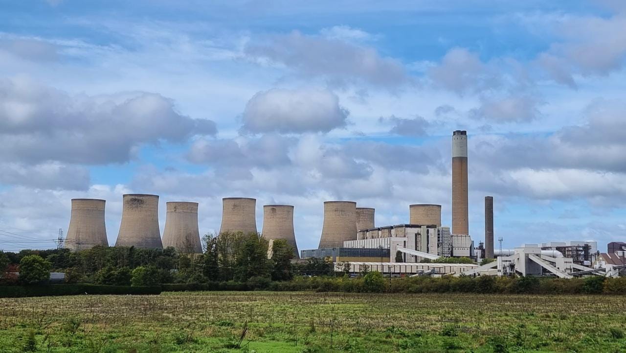
Photo credit: Credit to the cover photograph/featured image goes to my partner, who was passing Ratcliffe-on-Soar on Friday and was kind enough to take some quick shots for me. If someone is willing to indulge your obsession with different forms of energy, they’re a keeper.
Here are a few more: probably some of the last few taken in its final days of operation.


My Dad worked at West Burton power station for many years. That plus the other Trent power stations provided a significant percentage to the national grid.
We are going to need to build a few new nuclear stations fairly quickly aren’t we?
Great summary of the changes over the last 150 years. One extra graph could have shown how much Britain was importing coal in recent years.
It'd be great to see a follow up piece on how the supply side flex we've been getting from coal has been replaced by gas. And in future will be replaced by (electric and thermal) storage and demand side flex.