
Will oil and gas consumption keep rising through 2050?
Unpacking some of the assumptions behind the IEA's policy scenarios.

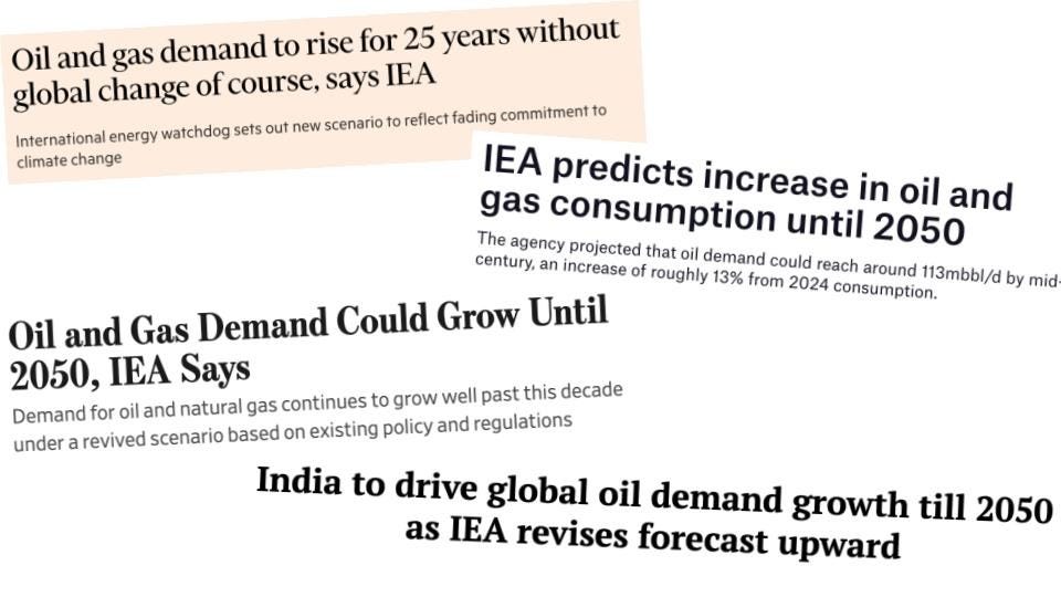
“Yes” was what many media outlets reported last week.
Take a look at the headline clippings below (from the Financial Times, Wall Street Journal, Offshore Technology, and Telegraph India). There were many more.
These refer to the International Energy Agency’s newly published “World Energy Outlook 2025”. In this report, the IEA projects the evolution of global energy demand — and individual sources — in the coming decades under a number of scenarios (as we’ll see, this emphasis is important).
One of these, which was retired for a few years but has made a comeback, is the “Current Policies Scenario” (CPS). That’s the one that all of the headlines are referring to.
Before we get into what this scenario actually entails — and think about whether it’s likely — it’s worth clarifying what the IEA means, or does not mean, by it. It is very clear in its report that:
“The CPS is not a forecast or a prediction of the way the energy system will unfold. Nor should it be interpreted as a “business-as-usual” scenario.”
Again, it is a scenario. It is not a forecast or a prediction. So at least half of the headlines above are immediately incorrect. It might seem like I’m being pedantic on terminology (as are the IEA, since they dedicate entire articles trying to clarify this), but these distinctions matter.
A scenario is basically a “what if” story. It makes a bunch of assumptions, and asks what the outcome will be — in terms of energy supplies, or CO2 emissions — if those hold true. They’re useful in exploring what the future would look like if the world did x or y.
A forecast is more like a “best estimate” trajectory of what will happen based on current evidence and trends. You might call this an expected pathway.
A prediction is asserting what you think will happen.
The IEA’s CPS is not what it says will happen. Nor is it even what it thinks will be the most likely trajectory (a forecast). It simply models the outcome of what would happen based on a bunch of input assumptions. How closely these scenarios match someone’s predictions depends on how reasonable and likely they think those inputs are.
What are the CPS’s assumptions? It only includes changes driven by policies that are already written into law or regulation; it excludes future policy changes, even where governments have announced intentions. Other drivers — technology cost declines, economics, demographics — are still in the model, but they only move the system as far as today’s policies allow. For that reason, I think the CPS is incredibly pessimistic about the speed of the transition (or, rather, that there is even a transition at all).
Running several scenarios is incredibly useful for understanding how trends would evolve under different conditions. The problem is that these are often misinterpreted or miscommunicated. They can take on a whole new world of their own.
If you have no understanding of the assumptions underlying any scenario, it’s impossible to know how to treat them. Only by looking under the hood can we start to judge whether they seem likely or not.
Here, I wanted to make the CPS a bit more transparent and show what the IEA assumes in some key areas, specifically the rollout of electric vehicles, and the speed of solar PV deployment.
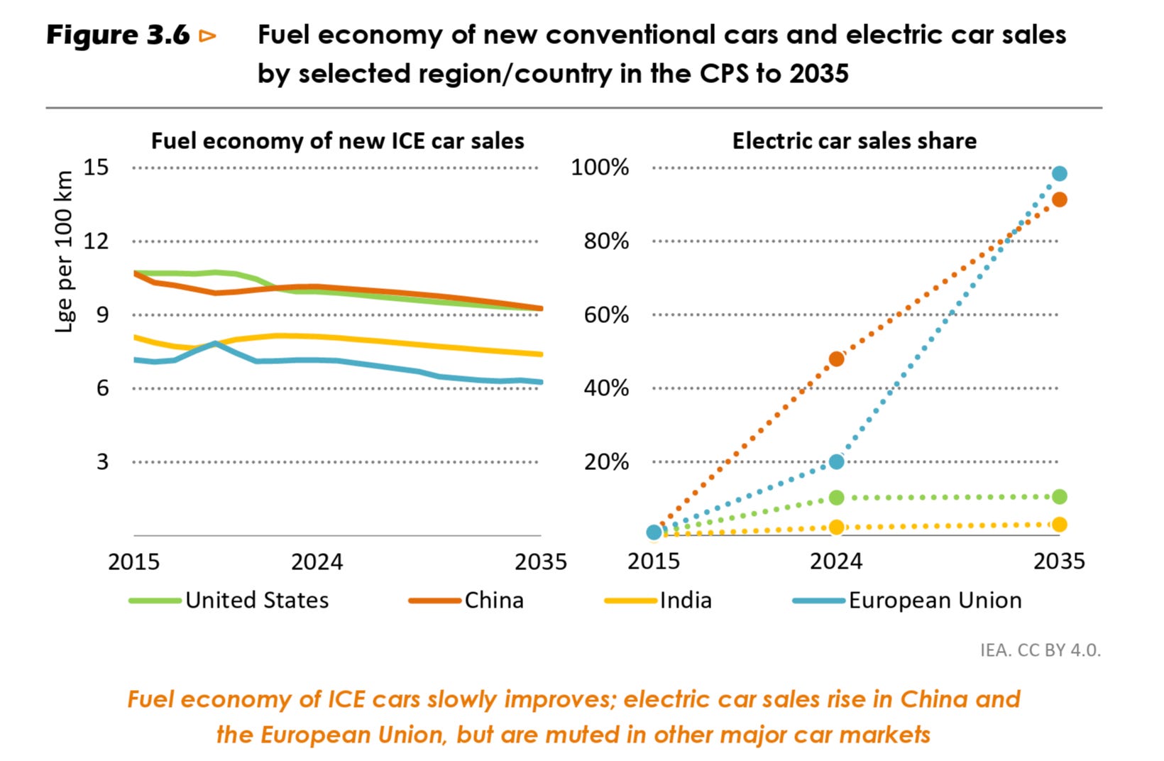
The electric car rollout stalls everywhere but China and Europe
Many countries in the world don’t have existing policies or legislation in place that would dramatically shift EV adoption rates. They often also lack charging infrastructure to absorb more electric cars without expanding it. The CPS assumes that neither changes.
That means the only regions where EV sales do grow are in the European Union and China. As you can see in the chart below, they achieve nearly 100% EV sales by 2035. But in every other region, EV sales basically stall at their current level.
What this means at a global level is that the market share for EVs increases from 25% today to 40% in 2035. But then this share falls a bit through to 2050, as most cars will be sold in countries where EVs have somehow been stuck at a multi-decade hiatus.
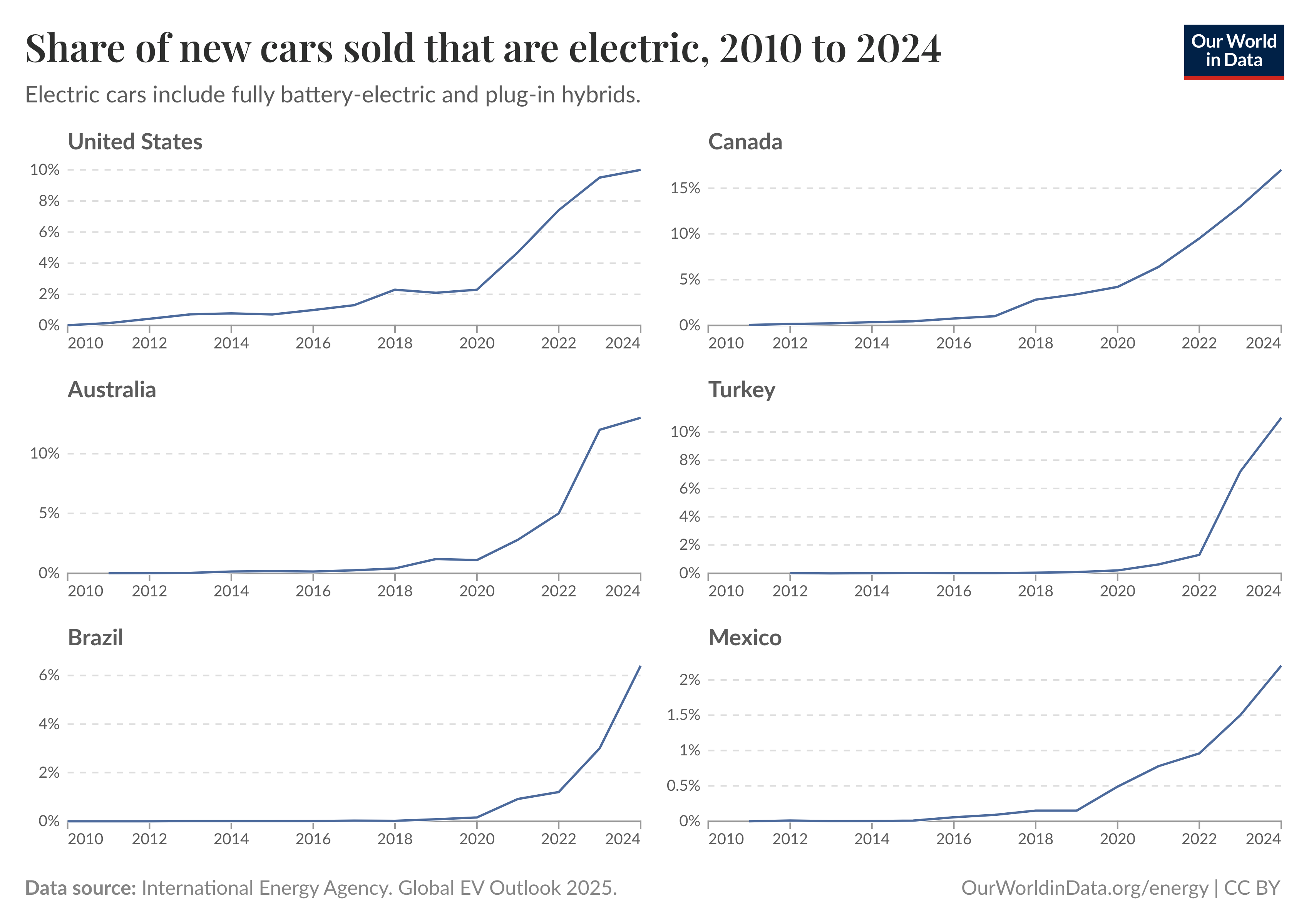
Is this a reasonable assumption?
You be the judge. Take a look at the chart below, which shows the share of new cars that are electric in countries outside of the EU and China. Now imagine that those curves suddenly level off and never rise again. That’s what the CPS assumes.
I can’t tell you the pace of the global EV rollout. I also think that many countries will have temporary stalls in their EV sales for various reasons. Maybe we’ll see that in the US in the next few years. But given the historical rates of growth, the fact that electric cars continue to get better and cheaper, and national motivations to be free from the ups and downs of global oil markets, it seems implausible to me that all of these curves suddenly and permanently level off.
If EV sales stalled across most of the world, and efficiency improvements in petrol cars dramatically slowed (which the IEA also assumes), then you will get a result that says that oil demand will continue to increase all the way through to 2050.
The point is not that we should never consider what this scenario might look like. It’s useful and important to know what might happen to the EV rollout absent of new policies or other market and technological forces driving things forward. But it’s crucial for people to know what it is that they’re looking at. Clearly, judging by the headlines and broader discussion, this is not the case.
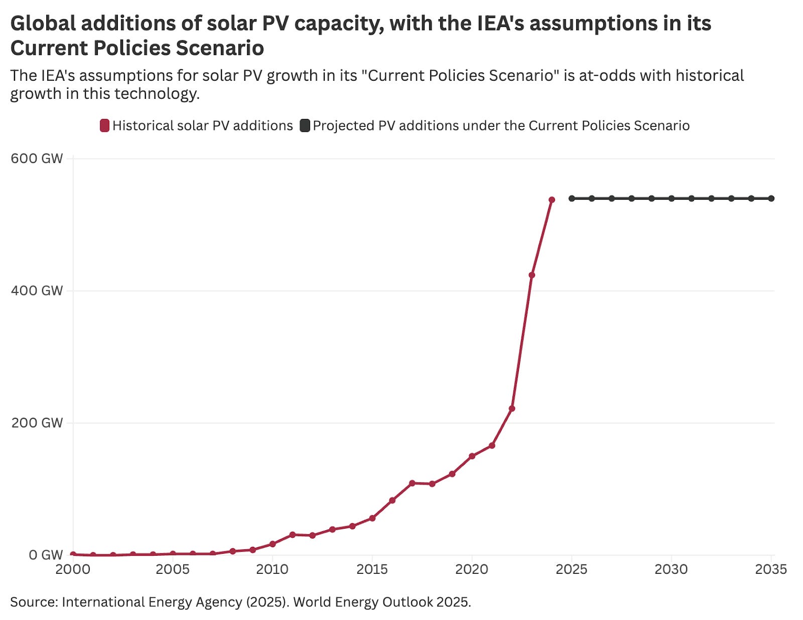
Global deployment of solar PV stalls at 2024 levels
Moving from transport to the electricity grid, another interesting assumption in the Current Policies Scenario is that solar photovoltaic (PV) deployment stalls at its 2024 levels for more than a decade.
As it states:
“Solar PV and wind continue to expand, but they face mounting integration challenges in the CPS in the absence of additional government policies, which slow their deployment. Annual solar PV capacity additions average 540 GW to 2035, holding steady at roughly the 2024 level, and halting the trend that has seen deployment rise ten-fold from 2015 to 2024.”
To provide some context for what this looks like, I’ve plotted the IEA’s historical data on solar PV deployment (in red) and added a line that shows future deployments stalling at 540 GW through to 2035.1
Does this trend also seem reasonable?
It does repeat the pattern of now-infamous “expectations vs. reality” solar PV chart, which was first produced by Auke Hoekstra. The IEA’s “policy scenarios” projected a stalling of global PV deployment as far back as 2006, but actual growth has consistently exceeded these expectations year after year.
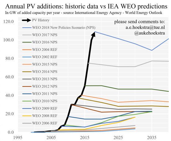
I think the assumption that solar PV will top out at 2024 levels for more than a decade is overly conservative and pessimistic. I don’t think this will happen in the way it’s portrayed in the chart.
However, this assumption is not quite as bewildering as the one on electric vehicles. There is a reasonable discussion to be had about when global deployment rates start to slow. Solar deployment has undergone several “doublings” now. That curve probably doesn’t have many left in it. When China’s rates start to slow — which they eventually will — this will have a big impact on the global total. Even if deployment is going strong and continuing to rise in other low-to middle-income countries, they’re too small to pick up the “slack” from China’s slowed rates.
I still think it’s unlikely that we’re at peak solar PV deployment globally. Some might disagree.
That’s fine, and that’s the point of laying out some of the crucial underlying assumptions of these scenarios. You can judge what you think is realistic or not. But without this transparency, many are left with headlines like “IEA predicts increase in oil and gas consumption until 2050”. This is not what the IEA predicts, because it does not provide predictions at all.
I’ve summed the historical data for “PV distributed systems” and “PV utility-scale systems” for each year.
This has been unified by the IEA to direct current (DC).
https://www.iea.org/data-and-statistics/data-tools/renewable-energy-progress-tracker
This is helpful in critically thinking about the IEA’s report.
I sincerely hope that this excellent analysis is read, and importantly understood, by those purblind headline writers cited (to which should be added, to their chagrin, the usually reliable Reuters).
To be fair to the Financial Times, its' story did include a very pointed reference to an interview they had published earlier with Trump's henchman, Chris "King of Fracking" Wright, now moonlighting as US energy secretary .
In it, Wright had overtly reminded the IEA that the USA paid 14% of its budget, and should be publishing scenarios that reflected the present administration's (eccentric) world view on energy . The IEA obviously took the hint...