How big are global wildfires this year?
They're tracking much higher than the decadal average, with large wildfires across Africa.
Update (3rd March 2025): This information is now out-of-date. For an final summary of wildfires in 2024, please see my more recent article.Last year I wrote quite several updates on the extent of wildfires over the summer.
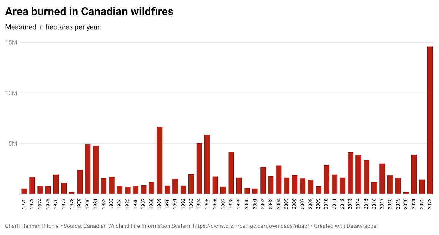
2023 was an exceptional year for Canada. The amount of area burned was more than double the previous record since the 1970s (this is probably also true with even earlier data). Below I’ve graphed the area burned by year, since 1972, based on data from the Canadian Wildland Fire Information System.
It was also a very large burn year in Greece. The amount of area burned was not quite as high as 2007, which was extreme, but it was the second highest since the 1980s, at least.
Having seen an uptick in stories and headlines in recent weeks, I thought it was time to check in on the scale of wildfires across the world this year.
As always, the disclaimer to this is that the wildfire season is not finished: these numbers will change, and can shift dramatically, in a matter of weeks. This is a check-in, not a final evaluation.
Global burned area is trending high for this time of the year
Since this year’s data is incomplete, it’s useful to look at the evolution of the cumulative burn by week. This means we can see whether the amount burned so far is higher or lower than the amount that is “usually” burned by mid-August.
In the chart below you can see this evolution across the year. The data for 2024 is in red; the trend for other years from 2012 onwards are in blue. It comes from the Global Wildfire Information System, which uses satellite measurements to track and monitor wildfires across the world.1
At this point, global wildfire burn is the highest it has been since 2012.2 You can see that, until a few weeks ago, it was a pretty average year. But there has been a steep rise since then.
Where are the big wildfires happening?
The chart below shows this same data by region. I’ll zoom into specific countries later.
So far, it has been a low-to-average year for Europe, Asia, and Oceania. The uptick in recent weeks has been in North and South America, and especially Africa. The latter two are seeing their “worst” year at this stage since the dataset began in 2012. In North America, only last year was higher.
Which countries are seeing a large wildfire year?
Let’s look at the spread of wildfires within each region. Obviously I can’t show every country, but I’ll try to make sure that the key countries that experience the largest fires are included.
North America
Total wildfire burn in the United States has been tracking a fairly “average” year, so far. As you can see in the chart below, it’s fairly “middle-of-the-road”. This doesn’t account for the distribution of fires within the country, so it’s plausible that fires in some regions are higher than normal.
The big uptick that we saw for North America in recent weeks has been in Canada. You can see that a month ago, it was also tracking for a relatively “average” year, but burn rates have increased steeply in the last few weeks.
South America
It has been a large wildfire year for many countries in South America. El Niño conditions, on top of warming due to climate change, has resulted in extremely hot and dry conditions, which increases wildfire risk.
Brazil, Bolivia, Venezuela, Ecuador and Peru are all seeing record years (based on data since 2012) for this time of year. You can see this in the chart below, where I’ve shown these countries first.
Not every country has seen large wildfires, though. In Argentina and Chile, it has actually been a low-burn year. Paraguay and Colombia are experiencing pretty average conditions.
Africa
I rarely hear about wildfires across Africa. I hear about Greece (and sometimes Portugal) in Europe; the US and Canada; Australia; and sometimes South America. Fires in Africa rarely make the headlines.
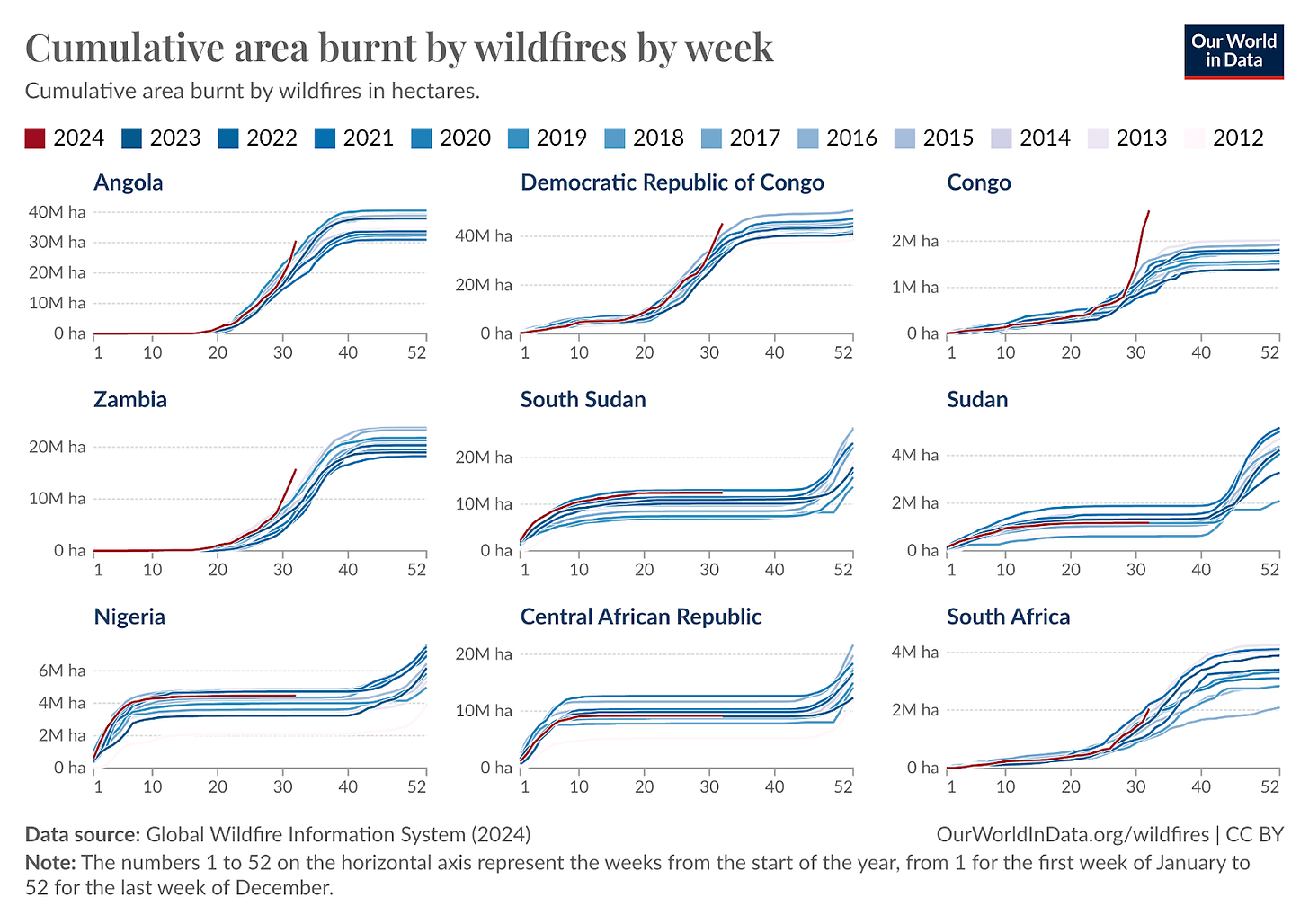
But it has been a big year for many countries across Africa, with a rapid uptick in burn area over the last month. You can see this in the trends for Angola, Democratic Republic of Congo, the Congo, and Zambia in the chart below. Most of these countries are right in the centre of the continent. Wildfires in the South, East and West have been less extreme, and are typically “on-trend”.
Savanna burning for agriculture is a major driver of wildfires across many of these countries. Farmers will often burn crop residue, and clear vegetation for new farming land. So it’s unclear whether most of this is deliberate land clearing, or unintended natural outbreaks.
Europe
It has been a relatively standard year for European wildfires so far. One exception — as you can see in the chart below — is North Macedonia, which has seen fires far above the decadal average.
Wildfires have been growing in Greece in the last few weeks, and this is exactly the time that in previous years, burned area increased rapidly. Often this happened within a period of one or two weeks. So, this could change rapidly over the next month.
Asia
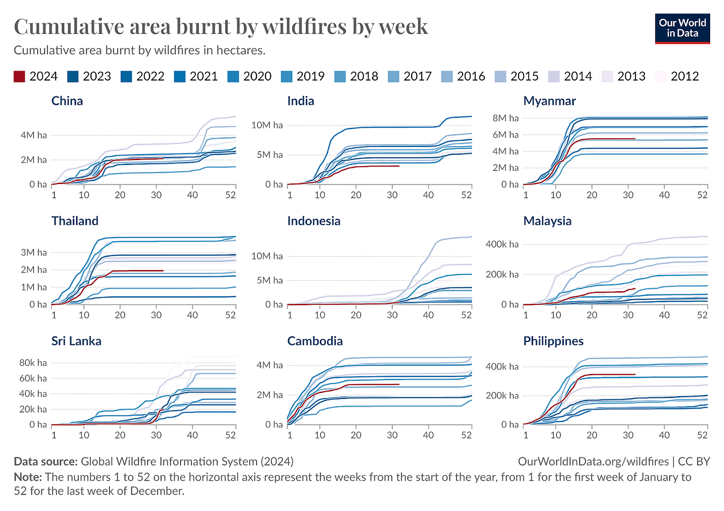
Wildfires across Asia haven’t been exceptional this year. Most countries have had fires around the decadal average — or are even below that average. The typical wildfire season in Asia is pretty much over, so this seems unlikely to change in the coming months. Indonesia and Sri Lanka might be the exception, as fires often break out there in September and October.
In the chart below you can see the trends for a number of countries in Asia.
Oceania
It’s currently winter in Australia and neighbours, so it’s not peak wildfire season. We will have to wait until November through January to see the extent of wildfires this year.
Last year was a big year for Aussie fires — the highest line for it in the chart below is 2023.
Track wildfire data across the world
As I’ve said previously: it’s hard to get a grasp on the extent of wildfires from the news. You need the context of what a “typical” wildfire year is, and how recent burn rates compare.
The GWIS updates its data weekly, and my colleague Veronika Samborska and I have built a page to follow the trends for any country on Our World in Data. Explore the data here.
Credit to my colleague Veronika Samborska at Our World in Data, who I built many more useful charts with (you can find them here).
Unfortunately I don’t have good and consistent global data that goes further back in time than this, to see how it compares to a longer record.


Is there any data on wildfire intensity? Area burned only tells a very small part of the story (especially given that wealthier countries invest a huge amount in trying to control wildfires). In more "natural" (or rather, "traditional" fire management regimes used by indigenous cultures around the world for thousands of years), we would have very large areas of low-intensity fires every year - e.g. fires that would typically not burn the canopy. Now, in North America at least, we have a large area of very high-intensity wildfires.
Thanks for this look at the data. Context is important.